
Labor Induction Decision Aid
⌛ 7 min read
Project Info
Year: 2022
Category: Prenatal Care
Product: Responsive Website
Agency
Blink UX (Boston location)
*Summer UX co-op program (3 months)
My Role
Conduct stakeholder interviews, lead concept + strategy workshops, create low-fidelity prototypes for testing and hand off high-fidelity wireframes and design components to the client’s development team.
Introduction
Figuring out a baby’s exit strategy is overwhelming, and reading about pain management actually brings more pain. The same rings true even when one has a Master's in Maternal and Child Health.
In June 2022, I had the great honor of creating a labor induction digital decision aid for Partner to Decide through a three-month co-op with Blink UX. Our mission is to create an accessible digital decision aid that advocates for shared, informed decisions on labor induction.

Previous version of induction decision aid (paper)
Working remotely as a team
Our team comprised visual designers, UX researchers, and mentors working across two time zones. How do we make it work? By respecting designated meeting times, incorporating tools for progress tracking(Slack, Zoom), collaboration(Figma, Mural, Coda), and actively seeking feedback.
Lilly Murphy (Visual Designer), Katie Xu (UX Researcher), Sunny Cheng (UX Designer)
Project Manager: Kate Pollasch
Directors/Mentors: Megan Greco, Jill Hannay, Sylvian Durst, Ben Shown
Define the Problem
TOOLS & METHODS Qualitative Interviews, Journey Map, Mental Models
Don’t think FOR them, think ABOUT them
We conducted 7 qualitative interviews with participants who were either pregnant or experienced labor, as well as, stakeholder interviews with Partner to Decide’s founders and 2 nurses.
🤰🏽 Pregnant people feel
They are constantly playing catch-ups during check-ins instead of discussing the priorities that impact their labor decision. What’s more, the Internet is a rabbit hole, raising more concerns and questions than answers.
👩🏻⚕️ Healthcare providers feel
Personalized care is THE goal, but one can only do so much in 15 minutes. The time constraint on appointments forces healthcare providers to prioritize certain information and shelve the opportunity for shared decision-making.
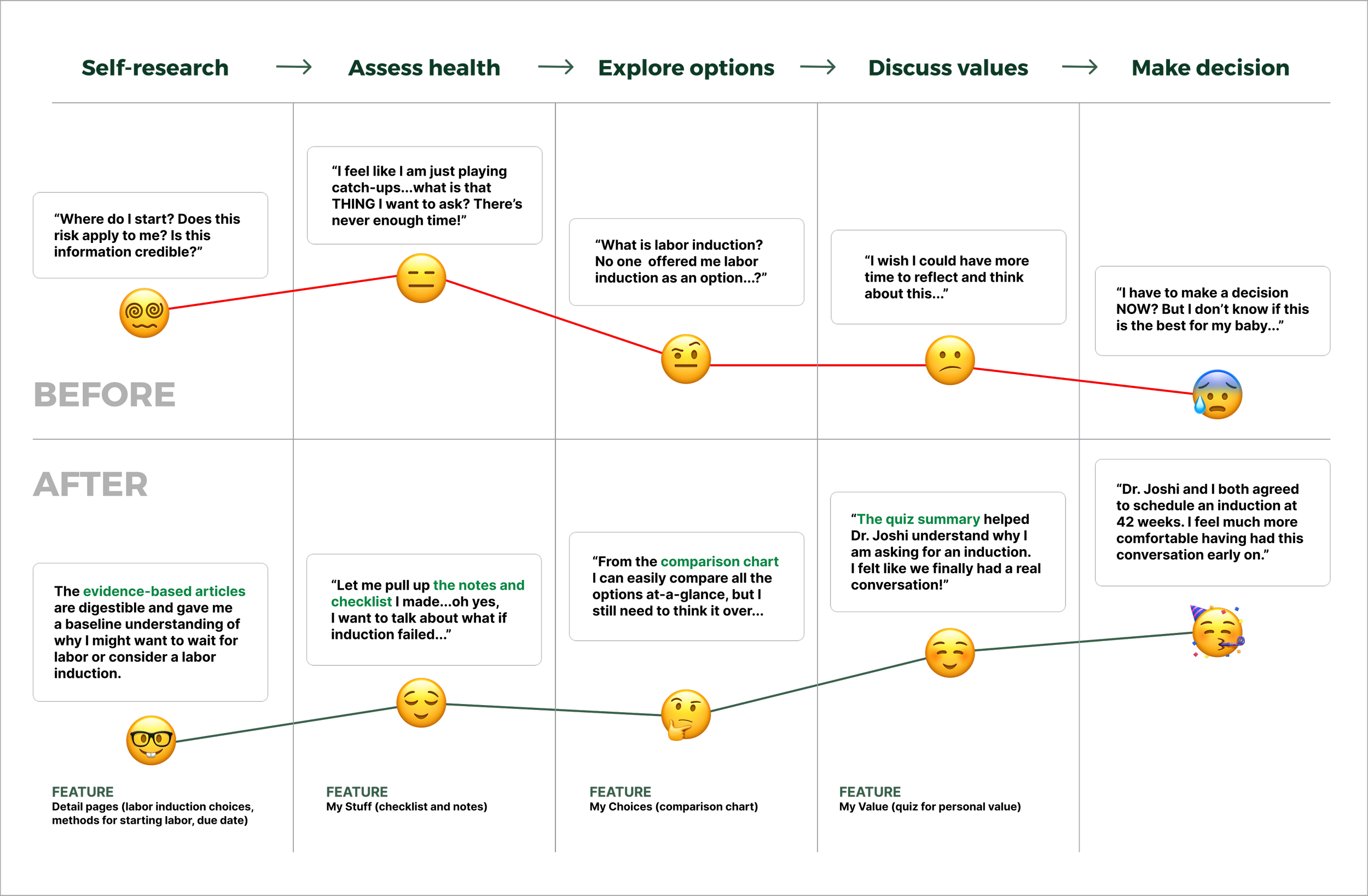
Decision aid as a conversation primer
A high-level current state Journey Map was created to capture pregnant people’s decision-making process and identify opportunities for shared decision-making.
Our key takeaway is that the 15 minutes check-ins should focus on what really matters - communicating a decision or clarifying concerns. The decision aid can prime pregnant people in their own time to bolster confidence during appointments.

The Advocate vs. The Researcher
Emerging from our interview insights are the two representative decision-making approaches. The two mental models offered potential directions for designing hero features and user flows for testing.

Explore Directions
TOOLS & METHODS Competitive & Comparative Analysis, “How Might We” Questions, Feature Priority Model, Concept Cards, Moodboards, and Visual Sketching
Inspired by what’s there and NOT there
In order to minimize cognitive load through familiarity (Jakob’s Law) and assess existing solutions, I collected design precedents in prenatal care and examples that addressed key pain points from the foundational research interviews.

Using the competitive & comparative analysis as a reference, we produced “How Might We” questions to frame the pain points for ideation and create a pre-populated feature list for the feature priority model.
How might we…
Simplify complex medical information to something that can be understood quickly and easily? #Accessible Content
Help pregnant people compare birth options in an easy, engaging way, without losing too much detail? #Value Clarification
Make sure no important questions are missed during regular check-ins? #Tracking Progress
Know when to be a buzzkill
The feature priority model enabled our client to voice preferences, concerns, and visions so we can align on product strategy. I evaluated each feature on the pre-populated list with the client based on:
How does it impact the overall user journey?
Is that enough payoff given our resources and time?
Is there any concern, admin, or maintenance involved?
We were able to weed out none essential features, including an algorithmic approach that suggests optimal birth options based on personal value inputs. Is it cool? YES! Is it feasible? NO! Not only do we lack the data that links personal values to birth choices, but inputs from healthcare providers are also crucial.

Collective sketching for the win
Using the four “How Might We” questions as design prompts, Blinkers from different teams graced our project in a virtual workshop to quickly sketch up experience concepts. The concepts were critiqued and integrated into 2 mental-model-inspired user flows for testing.

Refine & Iterate
Concept-testing
We recruited and interviewed 10 participants from diverse cultural backgrounds.
The goal is to understand what aspects of the 2 approaches are most beneficial to their decision-making process.

For the Advocate, we created a hands-free experience that focused on using a value-reflection quiz summary as the rationale to buttress one’s birth choice.
For the Researcher, we created a lean-in experience that uses a comparison chart and notes-taking feature to record essential information for an in-depth discussion with the provider.

“If I had something like this, I feel like I would’ve been more comfortable and well-prepared.”
Learnings & Result
Lesson #1 Work with time constraints
…not against them. Help pregnant people cut to the chase in appointments with a customizable question checklist.

Lesson #2 Empower through personal value
A four-point scale quiz can impel pregnant people to prioritize what matters the most to their birth experience and utilize the summary to kickstart a discussion.

Lesson #3 Reduce cognitive load
I worked with the client to audit the content of the decision aid, making it more digestible through information chunking and popup definitions for medical terms. Additional imagery and iconography were also added for better memory recall (Picture Superiority Effect).

A side-by-side comparison chart of the three labor induction choices makes visualizing differences much easier.

Lesson #4 Mindful data representation
Decimal percentage data are illegible as bar graphs, so we created a dotted graphic to accurately portrayed the chance of infant death without being visually dramatic or triggering.

Emotionally-triggering data like loss of baby, baby admitted to NICU, maternal hypertension, etc. are collapsed in an accordion drawer for those who are mentally unprepared, but would like to revisit later.

To sum up…
Next Step
Delivery
By the end of the co-op, we handed off high-fidelity prototypes (mobile and desktop), brand guidelines, content audit docs, and design documentation (annotated wireframes and UI components) to the client and their development team.
*Development is currently ongoing


