FROOTLOOPS Cereal
Project Type
Package Redesign
My Role
Conceptualization and visual design
The Problem
Children are the primary target consumers for cereal, yet their experience is often messy, pouring the cereal everywhere but the bowl.
Summary
In the final year’s package design class, we were tasked with redesigning a commercial package. Students need to identify user needs and potential problems before introducing a new concept.

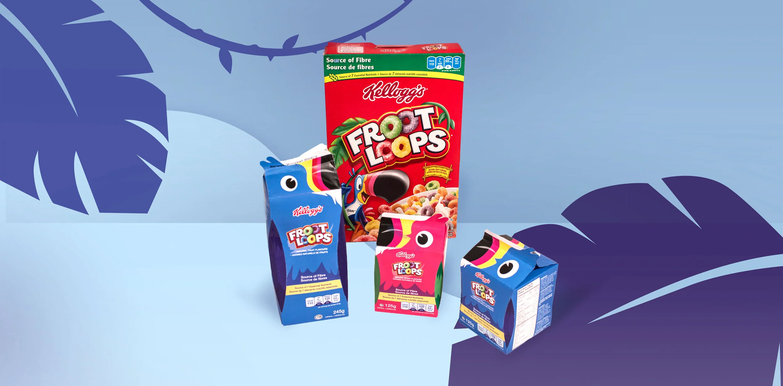
The Solution
The Concept
Reinventing with the brand’s mascot to create a fun, pouring-friendly package.


Pouring-friendly
The milk-carton-like design opens up to reveal the “beak” for better precision.
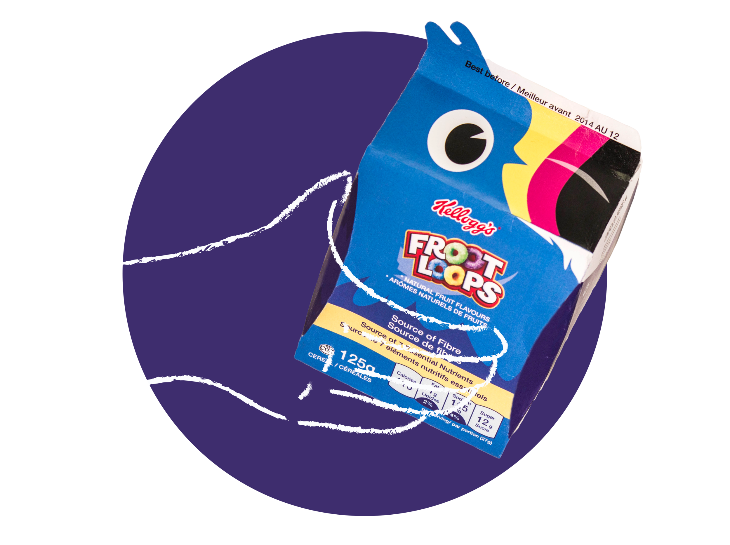
Improved grip
The folded-inward edges or “wings” are created to help with better grip around the box.
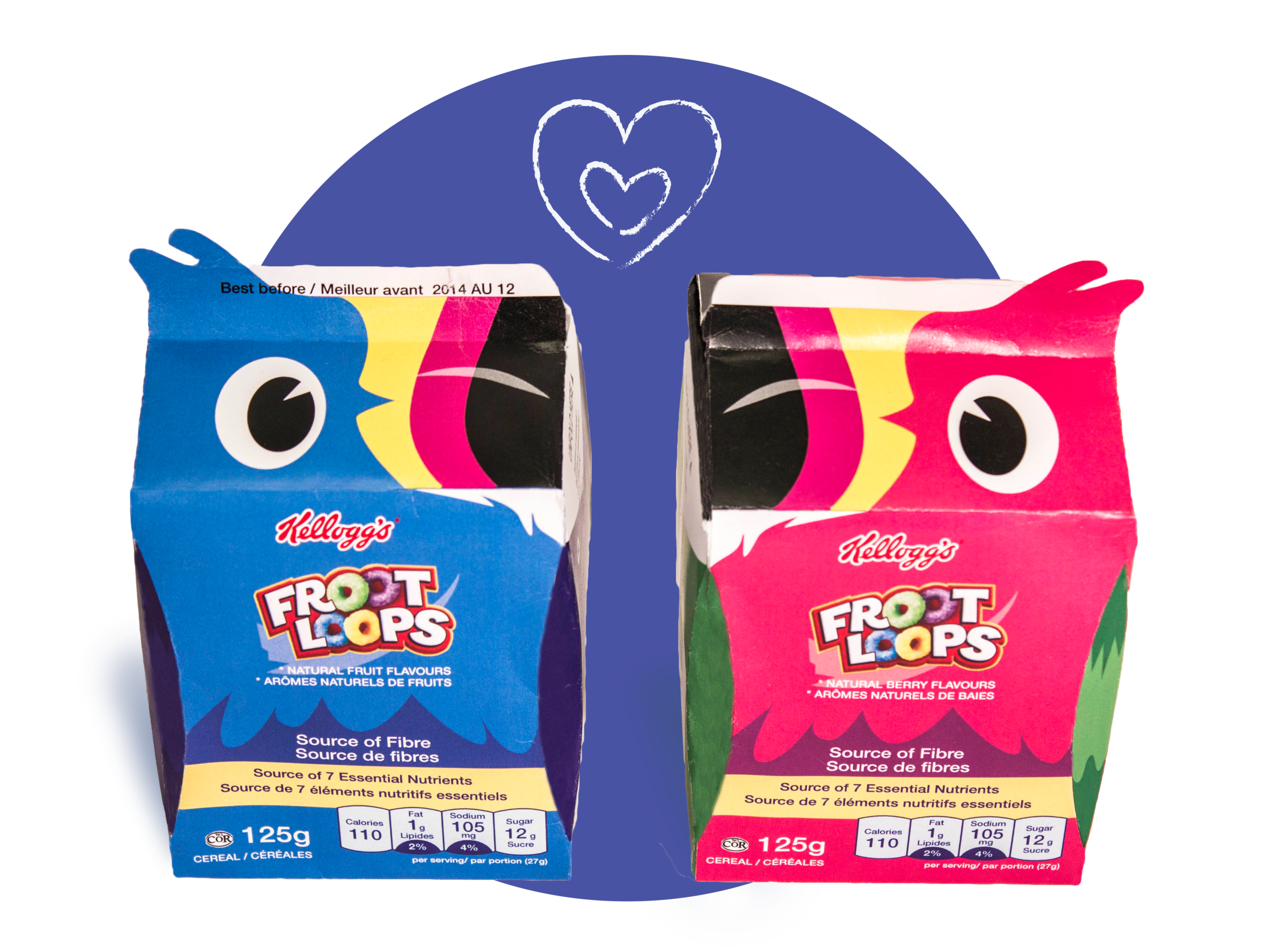
Flexible shelf display
The mascot visual opens up different shelf display possibilities (ex. Valentine’s Day would look like the above).

Size variations
The new design comes with regular and smaller sample sizes, so children can try out new flavours in smaller portion and fit them easily in their lunch boxes.